
In the first two articles of this series on Report Builder 3.0 (Part 1 | Part 2), we covered how to add a data source, dataset, and table to your report. Although we also reviewed how to add an indicator to your table, we touched on that topic only briefly. However, elements such as indicators are not to be taken lightly. These type of components-known as visualizations-play an import role in reporting because they provide users with a quick and easy way to understand complex data.
One of the most useful visualizations you can add to a report is a chart. Report Builder supports many types of charts that display data in a variety of ways. You can create a report that includes one chart or multiple charts, or you can add charts to a report that also contains tables and other visualizations.
In this article, I walk you through the process of adding a chart to a report and configuring the chart’s properties in order to display data in a specific way. To follow along with this example, you’ll need to set up a report that includes a data source and data set. On my system, I added the following components to my report:
- A data source that connects to the AdventureWorks2012 database on a local instance of SQL Server 2012. Another version of SQL Server or the database should work fine.
- A dataset that uses the data source to retrieve data from the AdventureWorks2012 database. I configured the dataset with the following query:
|
1 2 3 4 5 6 7 8 9 |
SELECT st.Name AS TerritoryName, DATENAME(mm, sh.OrderDate) AS OrderMonthDay, DATEPART(mm, sh.OrderDate) AS OrderMonthNumber, DATEPART(yy, sh.OrderDate) AS OrderYear, sh.SubTotal FROM Sales.SalesOrderHeader sh INNER JOIN Sales.SalesTerritory st ON sh.TerritoryID = st.TerritoryID; |
That’s all you need to get started. Once you’ve added your data source and dataset to the report, you’re ready to add the chart.
Adding a Chart to Your Report
Report Builder provides two methods for adding a chart to a report. The first is to use the Chart Wizard, which guides you through the steps necessary to add and configure your report. The other approach is to add the chart manually. That’s the approach I use in this article. I like the control that this provides me, and I think it will better help you understand the various ways you can work with a chart.
The first step, then, is to add the chart object to your report. To do so, go to the Insert ribbon, click the Chart icon, and then click Insert Chart. On the design surface, position your cursor at the top-left corner where you want to locate the chart. The cursor should now display a small chart icon. Drag the cursor to the bottom-right corner of your planned chart. As you move your cursor, an expanding generic chart is displayed.
When you release your cursor, the Select Chart Type dialog box appears, as shown in Figure 1. Here you select the chart type you want to display in your report.
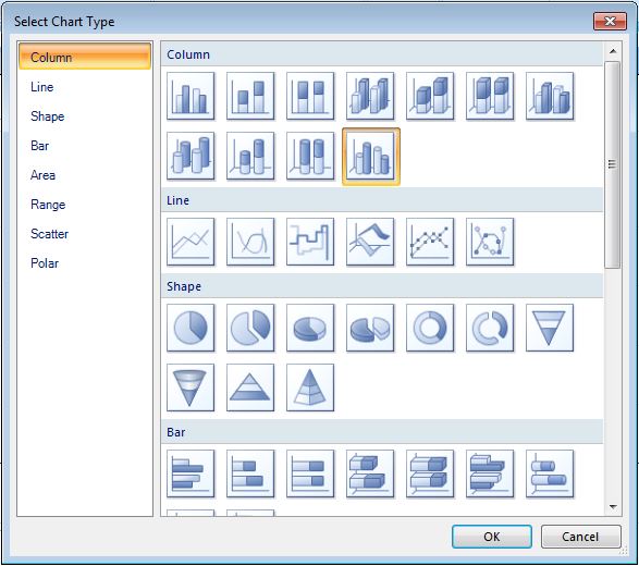
Figure 1: Selecting a chart type to insert into your report
As you can see, there are many to choose from. Sometimes you won’t know which one to select, but you can easily try various types to see if they display the data the way you want it displayed. For this exercise, we’ll use a 3-D Clustered Cylinder chart, which is a column chart type. In Figure 1, it’s the chart highlighted in gold. Double-click the chart to insert it into your report. Figure 2 shows what your design surface should now look like.
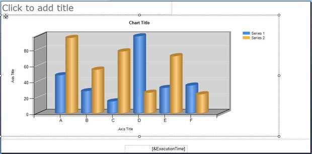
Figure 2: Viewing the chart when you first add it to the design surface
What you have here is essentially a skeleton on which you can build your chart. And the best place to start, in terms of fleshing things out, is to identify which dataset fields to associate with the chart elements. To do so, click the chart to display the Chart Data window, shown in Figure 3.
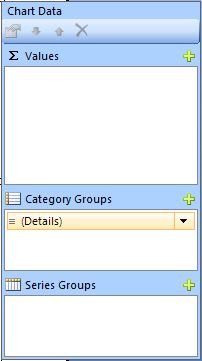
Figure 3: Configuring the chart’s data
The Chart Data window usually opens to the right of your chart. The window determines what and how field data is rendered in your chart. To configure the window, you add one or more fields to each of the three following sections:
- Values: Determines which data will be aggregated when rendered on the chart. This is where the number crunching usually occurs.
- Category Groups: Determines how to group the data that you want to aggregate.
- Series Groups: Determines how to categorize, or segment, the data that you want to group or aggregate.
The way that the Chart Data window works will become clearer as we work through our example. For most charts, you’ll want to add at least one field to the Values section. What you add to the other sections depends on the chart type and how you want to organize that data. But you’ll want to add at least one field to the Category Groups section, the Series Groups section, or both sections.
To add a field to a section, click the plus sign associated with that section and then select the field. Or you can drag a field from your dataset in the Report Data window to the Chart Data window. For this example, we’ll take the following steps:
- Add the SubTotal field to the Values section.
- Add the TerritoryName field to the Category Groups section.
- Add the OrderYear field to the Series Groups section.
After you’ve added the fields to the Chart Data window, your design surface should look similar to the one shown in Figure 4. Notice that, when you add the fields, the horizontal chart labels and the key (at the top-right of the chart) reflect the field names.
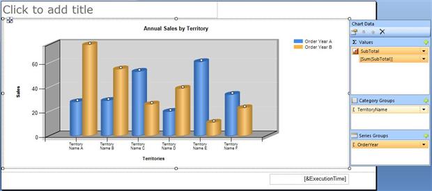
Figure 4: Configuring a chart that’s been added to your report
One more step I took to configure the chart was to modify the fixed labels near the vertical axis and horizontal axis. The labels now read Sales and Territories, respectively. I also updated the chart title to read Annual Sales by Territory. Now is also a good time to resize and reposition report elements as necessary. For example, I moved the text box in the footer to the right.
That’s all you need to do to get your report up and running. To view what you’ve accomplished, click the Run button. Your rendered report should look similar to the one shown in Figure 5.
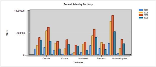
Figure 5: Viewing your chart in preview mode
As you can see, all the basics are there. But the report can still use some refining. For example, it would be nice to show more meaningful numbers in the vertical axis labels. Also the current report is not displaying all the territory names in the horizontal axis labels. So let’s look at steps we can take to make our report more readable.
Refining a Chart’s Properties
Report Builder provides a great degree of flexibility when it comes to refining your charts. In most cases, to make a change, you access a component’s properties and configure the specific settings. For example, suppose you want to refine the way the sales amounts are handled in the report. In the current dataset, the SubTotal values range from under $200,000 to over $8 million. Displaying this range of numbers in a chart can sometimes be messy looking, so one solution is to display all values on a per-thousandth basis.
To modify how the sales totals are displayed, we start with the Values section in the Chart Data window. Right-click the SubTotal field name in the Values section, and then click Series Properties. This launches the Series Properties dialog box, shown in Figure 6.
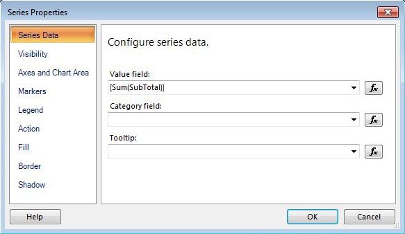
Figure 6: Modifying the series properties
Notice that the Value field text box specifies the SubTotal field, preceded by the Sum aggregate function. Report Builder automatically aggregates the fields you add to the Values section of the Chart Data window. However, that aggregation is based on total amounts. If we want to work with amounts on a per-thousandth basis, we need to modify this formula.
To do so, click the expression button to the right of the Value field text box to launch the Expression dialog box, as shown in Figure 7.
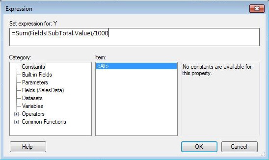
Figure 7: Adding an expression to the Value field property
When you first open the Expression dialog box, it displays the full expression that’s being represented in the Value field text box, which starts with an equal sign and specifies a fully qualified field name, as shown in the following expression:
|
1 |
=Sum(Fields!SubTotal.Value) |
To work with sales amounts on a per-thousandth basis, we simply divide the total by 1000. To do so, add the division (/) mathematical operator at the end of the formula and then add 1000, as shown in the following expression (and in Figure 7):
|
1 |
=Sum(Fields!SubTotal.Value)/1000 |
It’s that simple. Now click the OK button to close the Expression dialog box. You’ll be returned to the Series Properties dialog box. Your Value field text box should now include the <<Expr>> placeholder to indicate that an expression has been defined for that property’s value.
If you refer back to Figure 6, you’ll see that the Series Properties dialog box also includes the Tooltip property. The property lets you specify a value that’s displayed when a user hovers over one of the chart’s indicators. For our chart, we will display as tooltips the actual sales value for each year/territory indicator. So click the expression button next to the Tooltip text box and, in the Expression dialog box, add the following expression:
|
1 |
=FormatCurrency(Sum(Fields!SubTotal.Value)) |
In this case, we’re using the FormatCurrency function to display the sales amount as currency. Now when a user hovers over one of the chart indicators, the actual dollar value will be displayed.
That’s all you need to do to configure the series properties. However, because we changed the way that the sales totals are rendered, we must change the vertical axis properties to conform to our new standard. The aggregated amounts must correspond to the amounts on our axis so the data is effectively displayed on the chart. So your next step it to right-click the labels that run along the vertical axis and then click Vertical Axis Properties. Not surprisingly, this launches the Vertical Axis Properties dialog box, shown in Figure 8.
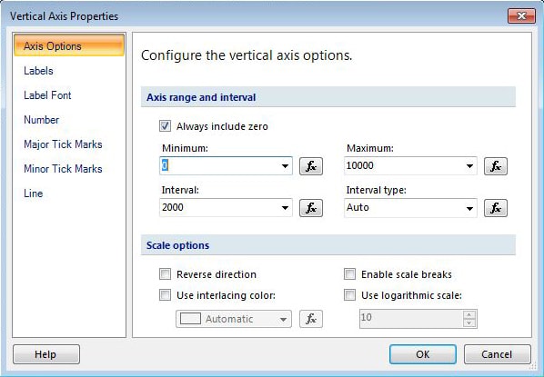
Figure 8: Configuring the vertical axis properties
By default, all the options in the Axis range and interval section are set to Auto. However, because we’re displaying our data on a per-thousandth basis, we’ll change the Minimum value to 0, the Maximum value to 10000, and the Interval value to 2000. The reason we use 10,000 as our maximum value is because our data does not go above 10,000,000 (10,000 x 1,000 = 10,000,000). These settings will provide a more readable way to display our sales figures, based on our dataset. Note, however, that if we were dealing with significantly different sale totals, we would want to adjust these settings to best accommodate our needs.
The next step is to configure how the figures themselves are displayed. Go to the Number page of the Vertical Axis Properties dialog box, and select Number in the Category list. Then select the Use 1000 separator checkbox and set the Decimal places option to 0. Figure 9 shows you what the Number page should now look like.
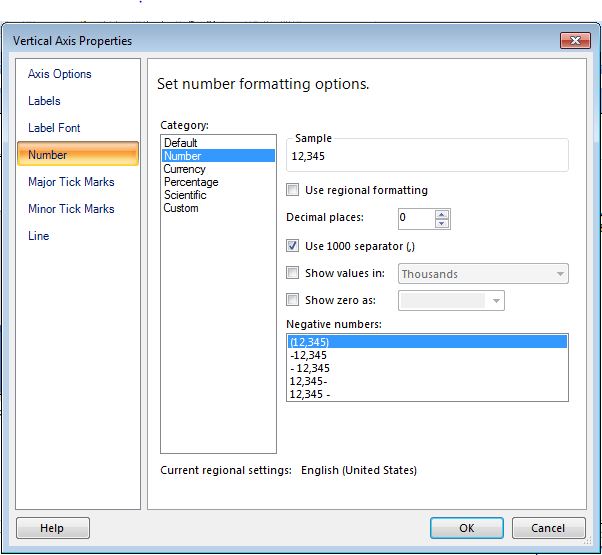
Figure 9: Formatting the numbers displayed on the vertical axis
Our next step is to configure the way the labels are displayed on the horizontal axis. As you’ll recall when you first viewed the chart (shown in Figure 5), only some of the territory names were being displayed. So let’s modify the axis properties to ensure that all names appear.
Right-click the labels just below the horizontal axis, and then click Horizontal Axis Properties. When the Horizontal Axis Properties dialog box appears, set the Interval value to 1, as shown in Figure 10. This setting ensures that all TerritoryName values appear on the horizontal axis when the report is rendered.
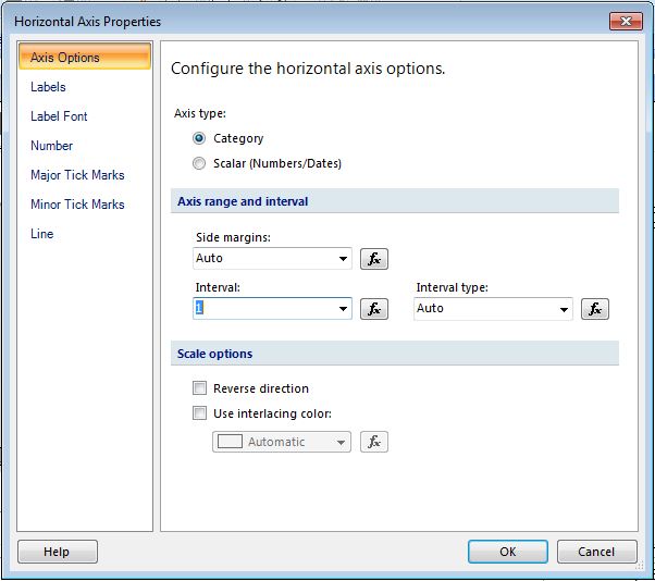
Figure 10: Configuring the horizontal axis properties
Although it’s relatively simple to display all the territory names, doing so might result in the names not being displayed the way you want them. You can control how they’re displayed on the Labels page of the Horizontal Axis Properties dialog box, shown in Figure 11.
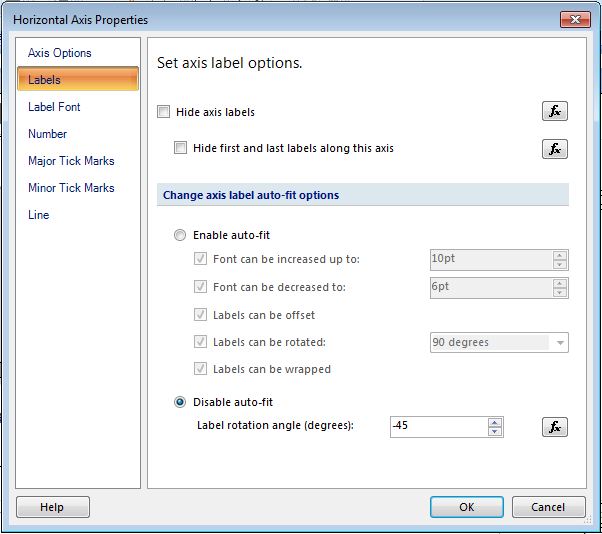
Figure 11: Determining how the labels are displayed on the horizontal axis
By default, the Enable auto-fit radio button and all the checkboxes in that section are selected, so Report Builder will automatically choose how to display the labels. In this case, that means the names will probably be displayed vertically. However, you might decide that they would look better on an angle. To set the display manually, select the Disableauto-fit radio button and then set the Label rotation angle (degrees) option to -45, as indicated in Figure 11.
After you close the Horizontal Axis Properties dialog box, you’re returned to the Report Builder design surface. This is a good time to change any other properties and report elements that may need to be modified. For example, you might want to change the label to the far left of your chart to reflect that the figures are in thousandths. Once you’ve finished, you chart and its configured options should look similar to the one shown in Figure 12.
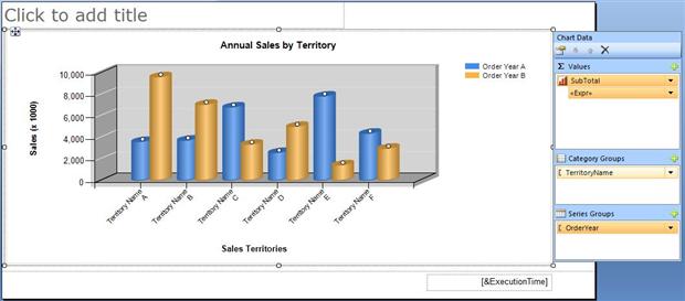
Figure 12: Viewing the formatted report in design view
Notice that the vertical axis labels reflect the 0 to 10,000 range, in intervals of 2,000, and that the numbers include the comma and no decimal places. Also notice that the horizontal axis labels are at a 45-degree angle.
That should about do it for this chart. When you click the Run button, the chart should now reflect all your changes and should look similar to the one shown in Figure 13.
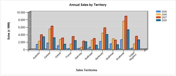
Figure 13: Viewing a preview of the rendered report
As you can see, all the territory names are displayed and appear at a 45-degree angle. In addition, the individual territory/year indicators correspond to the numbers shown in the vertical axis labels. If you were to hover over any one of the indicators, the specific sales amount for that indicator would be displayed as a tooltip.
Moving Ahead with Report Builder
Of course, you might want to make other changes to your chart, or you might want to include another chart type altogether. You can even change a chart in midstream, often without having to modify any other settings. Report Builder provides many chart types, in addition to the variety of other visualizations. And we’ve only scratched the surface with regard to the many options you have for displaying data. But you’ll find that the methods described here for adding and configuring a chart apply easily to configuring other Report Builder elements. In future articles, we’ll dig deeper still into the various ways you can make your reports more precise and more effective, regardless of what features you want to include.


Load comments