In the first four articles of the Report Builder 3.0 series (article 1 | article 2 | article 3 | article 4), you learned how to add tables, charts, and maps to a report and configure their properties. In this article, you’ll learn how to add and configure a matrix.
A matrix is a type of table that lets you aggregate data across both rows and columns, similar to a crosstab or pivot table. You set up the matrix by defining groups of data in a hierarchical order. For example, one of your groups might be based on dates, starting with years, then quarters, and finally months. The years would be at the top of the hierarchy and the months at the bottom. Repot Builder automatically aggregates the data based on how you’ve defined your groups across the rows and columns. In fact, Report Builder automates much of this process. You simply drag the fields you want to include from your dataset to the appropriate row or column, and then format the matrix components as best fits your needs.
In this article, we’ll add a matrix to a report that shows the number of bicycles sold by the AdventureWorks bicycle company (Microsoft’s fictitious company used to provide sample SQL Server data). The matrix will group data by product subcategory (types of bikes) and product names. It will also group data by the year and quarter the bikes were sold. If you want to create this matrix on your own system, you’ll need to create a Report Builder report and add a data source and dataset that retrieve AdventureWorks data.
On my system, I created a data source that connects to the AdventureWorks2012 database on a local instance of SQL Server 2012. I named the data source AdventureWorks. I then created a dataset that uses the AdventureWorks data source to retrieve the necessary sales data. I named the dataset ProductsSold. Finally, I configured the dataset with the following T-SQL query:
|
1 2 3 4 5 6 7 8 9 10 11 12 13 14 15 |
SELECT s.Name AS SubcategoryName, p.Name AS ProductName, d.OrderQty, YEAR(h.OrderDate) AS OrderYear, DATEPART(qq, h.OrderDate) AS OrderQuarter FROM Production.ProductSubcategory s INNER JOIN Production.Product p ON s.ProductSubcategoryID = p.ProductSubcategoryID INNER JOIN Sales.SalesOrderDetail d ON p.ProductID = d.ProductID INNER JOIN Sales.SalesOrderHeader h ON d.SalesOrderID = h.SalesOrderID WHERE s.ProductSubcategoryID BETWEEN 1 AND 3; |
For each order, the SELECT statement retrieves the number of bicycles sold, the subcategory and product names, and the year and quarter the bikes were ordered. The ProductSubcategoryID value, specified in the WHERE clause, determines that only bicycles are returned and not other products.
Once you’ve created your data source and dataset, you’re ready to create a matrix. The first step is to add the matrix to your report’s design surface and then to add the initial fields, so let’s get started with both of those tasks.
Adding a Matrix to Your Report
If you’ve read the other articles in this series, you already know the basics of adding an object to a report. You follow similar steps for a matrix. Go to the Insert ribbon, click the Matrix icon, and then click InsertMatrix. Move your cursor to the report design surface, to the spot where you want to position the top-left corner of the matrix. The cursor should now appear with a tiny table icon.
Click the left mouse button and drag the icon to the spot where you want to position the bottom-right corner of the matrix. When you let go, your design surface should look similar to the one shown in Figure 1. At this point, don’t worry too much about how you position and size your matrix. You’ll have plenty of opportunity to configure it as you’re adding other components.
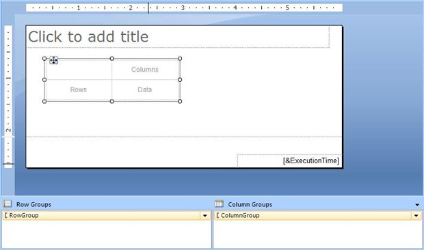
Figure 1: Adding a matrix to your report
Once you’ve added the matrix object, you can start adding the fields that define the columns and rows-and that also define the initial groups. The simplest way to do this is to add the top-level field from each group hierarchy. For this report, we’ll include two groups: one based on dates and one based on products. The top level of the date hierarchy will be the OrderYear field, and the top level of the product hierarchy will be the SubcategoryName field. The OrderQty field, which reflects the number of bicycles sold with each order, will provide the values to be aggregated. In other words, the number of bikes sold will be broken down by year and quarter as well as by subcategory and product.
To set up your matrix, take the following steps:
- Drag the OrderYear field from the ProductsSold dataset in the ReportData window to the Columns cell of the matrix.
- Drag the SubcategoryName field from the dataset to the Rows cell of the matrix.
- Drag the OrderQty field from the dataset to the Data cell of the matrix.
Your matrix should now look similar to the one shown in Figure 2.
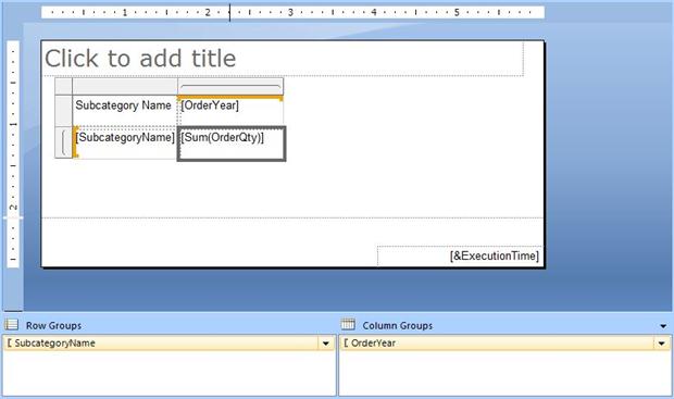
Figure 2: Adding fields to your matrix
There are several things to note about the matrix at this point. First, when you’re working within the matrix, the two-sided frame becomes active. That’s the thick grey border to the left and at the top. Also, the OrderYear and SubcategoryName fields are listed just as they appear in the dataset, except they’re enclosed in brackets to ensure that the name in its entirety is used correctly, should it contain spaces or special characters. The OrderQty field is treated differently, however. Because it’s been added to the Data cell, Report Builder assumes that this is the field that should be aggregated and applies the Sum aggregate function to the field. Finally, Report Builder also adds a column name above the SubcategoryName field. In this case, Report Builder automatically breaks the compound name into two words: SubcategoryName.
It’s not only the matrix itself that you should be aware of. Notice at the bottom of the design surface there are two windows: RowGroups and ColumnGroups. Report Builder automatically defines your initial groups based on the fields you added to the matrix. Because the SubcategoryName field is added as a row, Report Builder creates a row group that includes the SubcategoryName field. The same goes for the OrderYear field. Because it’s added as a column, Report Builder creates a column group that includes the OrderYear field.
At this point, you should run your report to see how the matrix appears when it’s rendered. Figure 3 shows what the matrix looks like on my system. As you can see, a column has been added for the subcategories as well as for each year, and a row has been added for each subcategory.

Figure 3: Viewing your matrix after adding the fields
Also notice in Figure 3 that the OrderQty values have been aggregated according to the groups we created. For example, according to the data, AdventureWorks sold a total of 2,415 mountain bikes in 2005 and 7,702 road bikes in 2008. As you can see, Report Builder does all the heavy lifting for you. All you have to do is drag the fields into the correct positions.
Expanding Your Groups
The power of matrices really becomes apparent when you start adding levels to your group hierarchies. For our report, we’ll break the years down to quarters and the subcategories down to products. The next step, then, is to drag the OrderQuarter field from the dataset to the OrderYear cell in the matrix. When you do this, be sure that a thick blue line appears at the bottom of the OrderYear cell before you release your mouse button. This tells Report Builder to add the OrderQuarter field below the OrderYear field and subsequently at a lower level of the hierarchy.
Next, drag the ProductName field from the dataset to the SubcategoryName cell in the matrix. This time, make certain the thick blue line appears to the right of the cell. Again, you’re telling Report Builder to add the new field as the next level of the hierarchy. Your matrix should now look similar to the one shown in Figure 4.
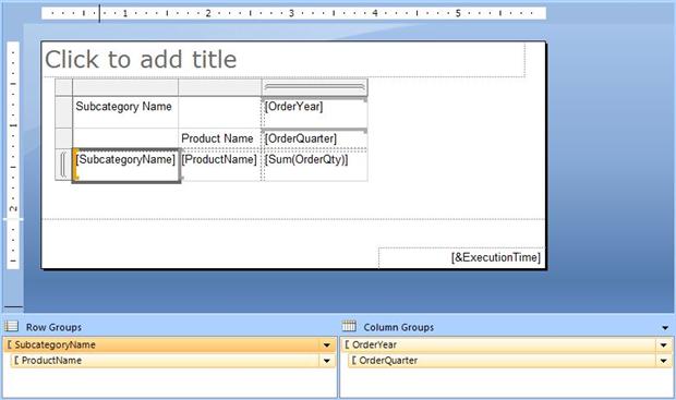
Figure 4: Adding a field to each group in your matrix
As you can see, a new row has been added for the OrderQuarter field and a new column for the ProductName field. This is the method that Report Builder uses to indicate that the groups now have multiple levels. Also notice that the new fields have been added as second levels to the groups shown in the RowGroups and ColumnGroups windows.
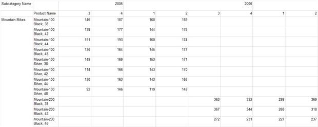
Once again, you should run your report to see what effect your changes have had. Figure 5 shows how the matrix now looks on my system (click to enlarge).
Figure 5: Viewing your matrix with the expanded groups
Because we’ve added the additional fields to our matrix groups, our report is much larger now, so what is shown in the figure is only the first part of the report. But as you can see, products and quarters are now included in the report, with the order quantities aggregated accordingly.
You’ve probably noticed that the matrix is not particularly readable, even though it contains the information we want. Fortunately, Report Builder includes a number of features that let us refine how the matrix appears, so let’s return to the design surface and play around with some of those options.
Formatting Your Matrix
The first thing you’ll want to do is to adjust your column and row sizes to better accommodate the data. To do this, click somewhere in the matrix to bring up the gray frame on the left and at the top. You’ll notice that the frame is broken into sections that correspond to the rows and columns. Use those sections to adjust the cell sizes. You might need to run your report after each adjustment to get the matrix just the way you want it.
This is also a good time to position the matrix where you want it in the report and adjust any other report elements. For example, I added a report title, AnnualBikeSales, and repositioned it. I also removed the default text box in the footer (the one the displays the execution time).
Another step I took was to configure the column heads. For the SubcategoryName column, I simplified the name to Subcategory, and for the ProductName column, I simplified the name to Product. I also made the text bold. To take these steps, I simply edited the names directly in the cells, as I would in Word or Excel. I also made the OrderYear cell bold and centered, and I centered the OrderQuarter cell.
Again, when making such modifications, run your report often. Report Builder makes it easy to see your changes immediately. When I finished with my initial formatting, my design surface looked like the one shown in Figure 6.
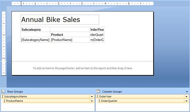
Figure 6: Formatting your matrix
One of the trade-offs when resizing your columns and rows is that the matrix itself, in design view, often becomes less readable. As you can see in Figure 6, this is particularly the case for the OrderYear column. However, we don’t want this column too wide because it will spread the data too far when displayed. Don’t forget, you now have a column for each quarter of each year. For any report, you always want to keep your data in mind, even if it means a little inconvenience in the design phase.
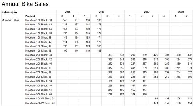
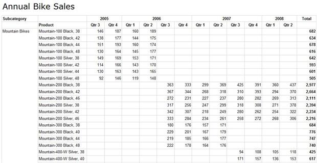
After you’ve completed your formatting, you should, of course, run the report once more. Figure 7 shows what the first page of the matrix now looks like on my system when the report is rendered (click to enlarge).
Figure 7: Viewing your matrix after it has been formatted
Notice that the products are now listed in a single line and the quantity columns are narrower, making it easier to display more information in a smaller space. Also notice that the column heads are bold and the year and quarter labels are centered. As a result of these changes, the matrix is much more readable.
Adding Totals to Your Matrix
Although the data so far might be useful, with totals for each product for each quarter, it would also be helpful to include totals that give us an overview of the sales, such as how many mountain bikes sold each quarter. Fortunately, Report Builder makes this as easy-if not easier-than creating the matrix itself.
For our report, we’ll add totals to the bottom of the report (for all subcategories), for individual subcategories, and for the years. To add totals for all subcategories, right-click the SubcategoryName cell, point to AddTotal, and then click After. Report Builder adds a row to the bottom of the matrix, as shown in Figure 8. Notice that the label Total is also included, along with the aggregated quantities in the last cell.
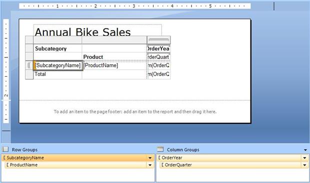
Figure 8: Adding a total to the subcategory group
Now we’ll do the same thing for the ProductName and OrderYear cells. Once again, right-click the cell, point to AddTotal, and then click After. For the ProductName total, Report Builder adds another row, but for the OrderYear total, Report Builder adds a column, as shown in Figure 9.
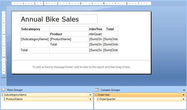
Figure 9: Adding totals by year and product
As you can see, a Total row has been added after the ProductName row, and a Total column has been added after the OrderYear column. Now when you review your report, it will have additional aggregated data across these subcategories. Figure 10 shows what the last page of the report looks like on my system.
Figure 10: Viewing your report after totals have been added
The report now includes the additional rows and column. The last row shows total number of bikes sold for each quarter for all subcategories of bicycles. The second-to-last row provides the totals for each quarter for that specific subcategory, in this case, touring bikes. In addition, the column to the right displays the total number of each bike sold for all four years.
Configuring the Values in Your Matrix
Adding the totals to our matrix makes it richer in detail but it also calls attention to the fact that we need to format it further to make sure it’s easy to read. The first step is to configure the way the quantities are displayed. For each cell that contains aggregated OrderQty values, right-click the cell, and click TextBoxProperties. When the TextBoxProperties dialog box appears, go to the Number page, as shown in Figure 11.
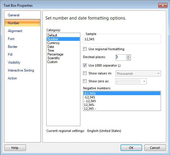
Figure 11: Configuring the numbers in your matrix
On the Number page, select Number from the Category list. Then set the Decimalplaces option to 0, and select the Use1000separator checkbox.
Next, we want to change the way a couple of our column labels are displayed. The first is the OrderQuarter column. Currently, we display only a number, but it might be nice to use something a bit more descriptive. So right-click the OrderQuarter cell, and then click Expression. In the Expression dialog box, modify the expression so it reads as follows:
|
1 |
="Qtr " & Fields!OrderQuarter.Value |
The formula simply adds Qtr (plus a space) before each quarter number so they’re not just floating out there and perhaps causing a moment of confusion.
Next, click the Total cell directly beneath the ProductName cell, and then click Expression. In the Expression dialog box, modify the expression so it reads as follows:
|
1 |
="Total " & Fields!SubcategoryName.Value |
This time, we’ve added the subcategory name after each total to make it easier to identify what this total is for.
Now is also a good time to refine any other formatting elements you think necessary. For example, I made all column and row labels bold, along with all total amounts. Figure 12 shows what my design surface looks like after applying all this formatting.

Figure 12: Configuring the cell values in your matrix
The <<Expr>> placeholder now appears where I defined expressions on the columns. Also, most of the cells are now bold, except those that include the subcategory and product names as well as the individual base totals (per quarter, per product). Figure 13 shows what the first page of the report now looks like on my system.
Figure 13: Viewing your matrix after configuring the cell values
Notice in the Total column that the comma is added to the numbers, where appropriate, and that the figures are in bold. Notice also that the quarter labels now include Qtr. If you were to scroll down, you would see the other changes we made.
Applying Advanced Formatting to Your Matrix
Now let’s put a few finishing touches on our report. The first is to ensure that our header rows are visible on every page and that they scroll with the user so longer pages are easier to read. To modify the matrix in this way, first make sure the gray frame is active. Right-click the frame and then click TablixProperties. In the Tablixproperties dialog box, select the Repeatcolumnheadersoneachpage option and the Keepheadervisiblewhilescrolling option, as shown in figure 14.
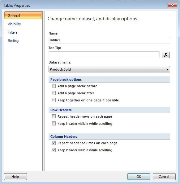
Figure 14: Configuring your matrix properties
Next, we want to control where the page breaks occur in our report. Because the report is divided into product subcategories, each subcategory would make a good place for the pages to break. To do this, we need to change the property settings for that group. In the RowGroups window, right-click SubcategoryName and then click GroupProperties. When the GroupProperties dialog box appears, go to the PageBreaks page and select the Betweeneachinstanceofagroup option, as shown in Figure 15.
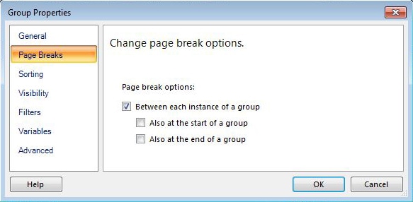
Figure 15: Configuring the subcategory group properties
The next step is to add borders around our cells. To do so, select all the cells by clicking the top-left one, pressing the shift key, and then clicking the bottom-right one. Then, on the toolbar, select 3/4 pt width and click All in the BorderSide drop-down list. This should add borders around all your cells.
Another step is to merge some of our cells. Let’s start with the Subcategory cell and the one below it. Select both cells, right-click them, and then click MergeCells. Do the same thing for the Total cell in the top-right corner and the cell beneath it. Then repeat the process for the Product cell and the one above that. When you do the Product cell, you might lose the Product label, so you’ll have to retype it if you do.
The final step is to add color to your matrix. As with any of the options, the colors you choose are up to you. To add color, select the cells that will share the same color. In the menu bar, click the Shading down-arrow and select your color. If you want to view more options, click MoreColors instead of selecting a color, and then choose a color from the expanded menu. When you’re finished, your design surface should look similar to the one shown in Figure 16.
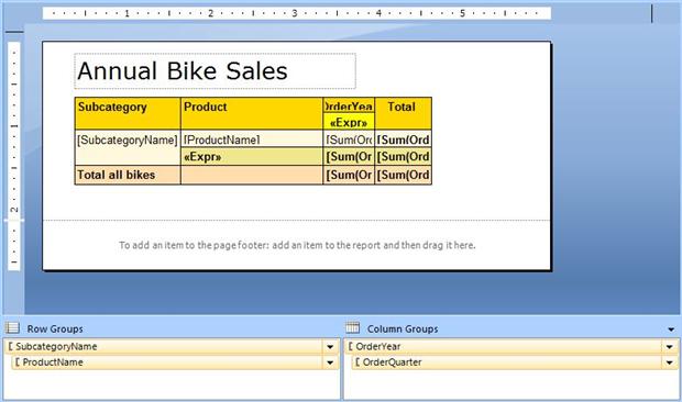
Figure 16: Adding color to your matrix
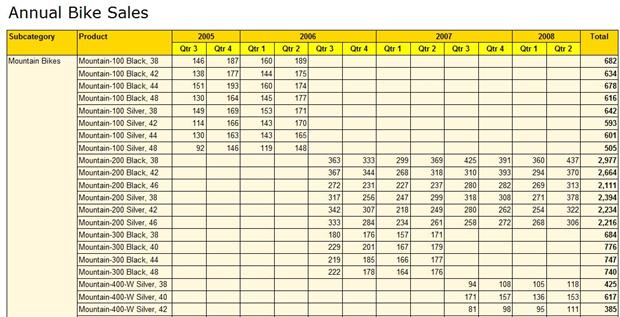
Your color scheme might look quite different than this, but what I’ve done here should give you a sense of what’s possible. When you run the report, you should see all the changes you’ve made, including the colors and borders. Figure 17 shows how the report’s first page now looks on my system, with all the formatting applied.
Figure 17: Viewing the first page of our report after adding color to the matrix
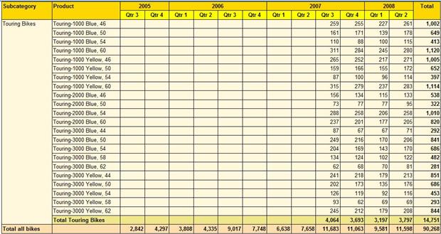
As you can see, the report now includes all the formatting changes, which should make the data easier to understand. If you were to scroll down toward the bottom of this page, the header rows would follow along so you always know what the data means. If you were to go to the end of the report, you would find it on the third page because there are only three subcategories and we’ve configure the matrix to display each subcategory on its own page. Figure 18 shows what the report’s last page looks like on my system.
Figure 18: Viewing the last page of our report after applying advanced configuration settings
All touring bike figures are now displayed on a single page, and that page displays the header rows, with the totals at the bottom. You can also see the cells that we’ve merged and the colors that we’ve added to the subcategory totals.
As this article has demonstrated, creating a basic matrix is a relatively simple process in Report Builder. The real work comes in formatting the matrix and ensuring that everything is displayed exactly how you want to. Yet what we’ve done here barely scratches the surface in terms of the formatting options available to you. You can, for example, create property expressions that display totals according to specific colors, based on what those amounts are. Or you can alternate the colors used for rows. But at least now you have a sample of what a rich and powerful tool the matrix provides. Like all elements of Report Builder, the key is to get in there and try it out for yourself and experiment with the different configuration options available to you.





Load comments