The series so far:
- The BI Journey: The Analyst
- The BI Journey: The Expert’s Advice – Part 1
- The BI Journey: The Expert’s Advice – Part 2
- The BI Journey: The Journey Begins
When Ruthie started her internship at AdventureWorks, the famous bicycle and accessories seller, she sparked off a business intelligence solution that even surprised her (The BI Journey: The Analyst). All she did was build a “dashboard” for her boss Stephen, the Sales Manager. Stephen found much value in the solution that Ruthie gave him, even trying to create his own reports from the data. The secret of this was the flexible semantic model that Ruthie had built. A semantic model, if built correctly, provides a business-centric, user-friendly, flexible interface of organizational data to the end user. Some of the credit was due to advice from George, the local analytics guy who works with the technology community. It was George who guided Ruthie to create a solution that was better than the first iteration with tips and advice on designing the solution and how to better present the data to the users.
A Typical Analyst’s Dataset
When George looked at the dataset that Ruthie had given him, the first thought that went through his head was “Gosh! Not a typical analyst’s dataset!” It was one big fat table that had all the columns that needed to go into the report. While it was good if one was running an analytical algorithm such as a forecasting model, it was painful when performing self-service analysis and George hated it. However, he thought that it was great that Ruthie had at least cleaned it up the way she had by only including columns that needed to be analyzed (facts) and the columns that were needed to perform the analysis of these facts (dimensions). He explained to Ruthie that what she had done was great for performing different types of analysis quickly and easily. He told her that her design gives way to a modeling technique called dimensional modeling.
However, he also told her that, if more sources such as the sales targets Excel file was needed to be correlated with sales, things can get a little complicated. He proceeded to explain more about modeling data for analysis.
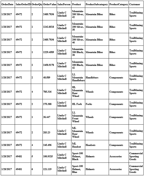
The sales table’s structure looked like what’s in Figure 1
Figure 1: Sales table
There are many types of analyses that can come from any combination of columns from this table. For example, Ruthie or Stephen could use it to look at the factual data, order value, broken down by product category as in Figure 2:
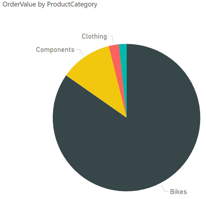
Figure 2: OrderValue by ProductCategory
Another analysis that they could perform might be order value for each product category purchased by each customer broken down by year (Figure 3).
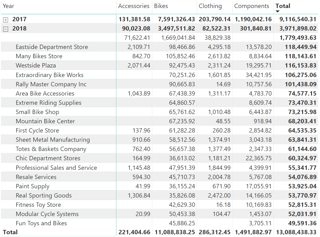
Figure 3: OrderValue by ProductCategory by Customer by Year
Correlating order value and order quantity throughout the months as in Figure 4 could also be another type of analysis that can be performed.
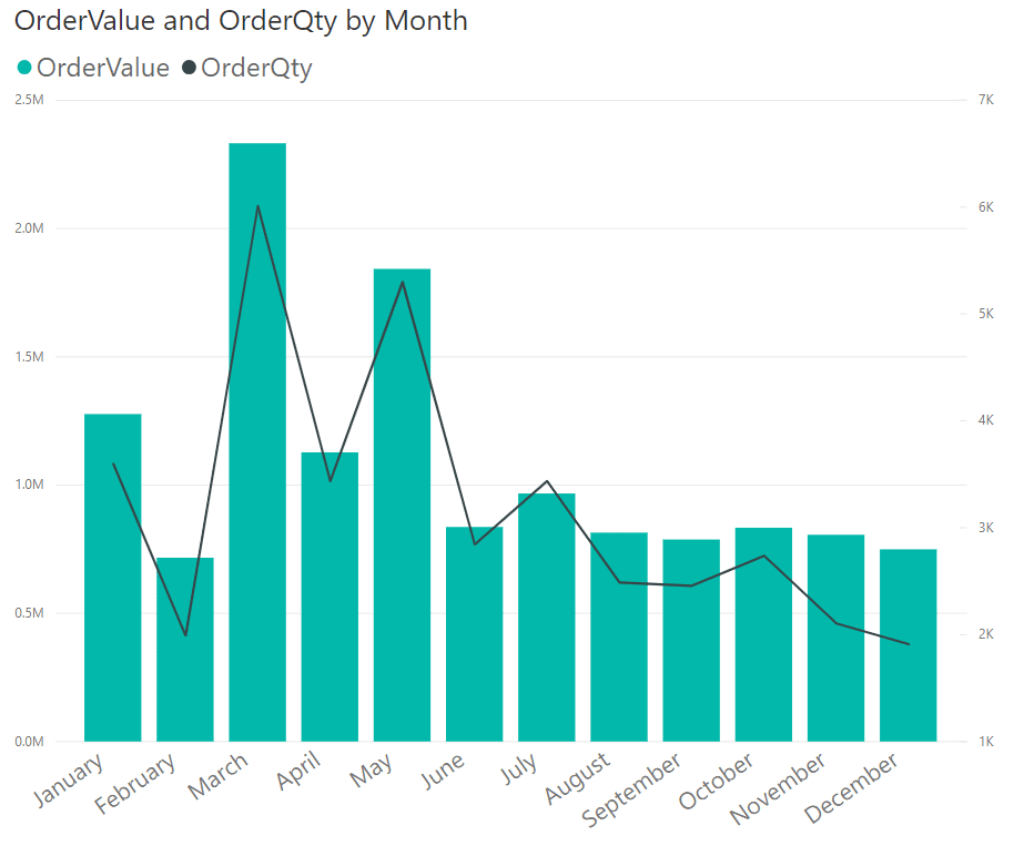
Figure 4: OrderValue and OrderQty by Month
However, George explained that in order to perform analysis in a flexible and efficient manner, a more structured technique had to be employed to construct the data structure. Facts and Dimensions
The first thing about creating a data structure that works well for analysis is to identify which columns are the ones that are going to be measured (facts), and which columns are going to determine the context or perspective of what was to be measured (dimensions).
Identifying facts is quite straight forward George explained to Ruthie; just ask the business, or as a business user you would probably know. Even if you weren’t a business user, you could still probably identify a lot of the columns that can be categorized as facts. These are usually numeric such as order value, quantity sold, call handling time, exam score, etc. Then, you need to identify the dimensions. These would be columns such as product, product category, date, and customer. These are quite easy to identify as well. However, the thing that you need to ensure is that columns that are not useful should not be taken into account. For instance, the product category is a great way of analyzing sales orders, whereas modified_by is not. Additionally, in many cases, groups of dimension columns can be identified as a single dimension. For instance, product, product subcategory, and product category can all be grouped up into the product dimension.
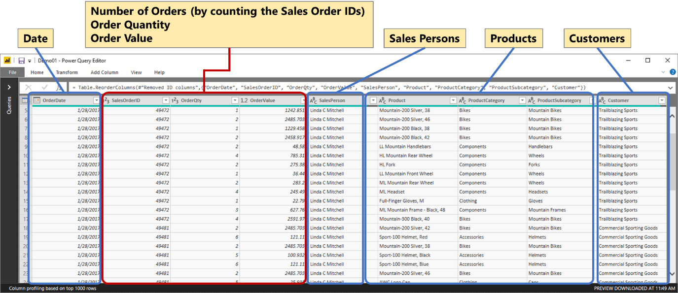
Figure 5: Sales Orders table
All in all, if you can divide your columns into facts and dimensions, and put up a diagram such as this, you are on the right path for proper analytics.

Figure 6: Sales dimensional model
Ruthie wasn’t convinced at first and thought that George had just split her table up into a fancy diagram. How was that even useful? George had agreed somewhat but told her to think of a scenario where you would need to analyze by year when all you have is the date column. Ruthie was quite familiar with Power Query by then. She responded that all you needed to do was to create a custom column or duplicate the date column and transform it to a year. Date and year can be grouped to be made into the calendar dimension according to George’s theory. It still hadn’t seemed compelling why a diagram such as the “dimensional model” had to be drawn. George had smiled, Ruthie was a fast learner, and he had her where he wanted her.
Dimensional Modeling
George then pulled up the Excel file that Stephen had shared, which had sales targets for the last few years. Stephen had wanted these targets to be correlated against the sales numbers. However, the granularity of the targets was different from that of the sales data, which was what George had wanted to point out to Ruthie to explain why the fancy dimensional model was needed.
He asked a simple question: since sales values are from one table and targets are from another, if you needed to compare them against each other, which table’s salesperson would you use? Or which table’s product categories would you use? Ruthie answered without thinking; use each table’s respective salesperson and product category columns. George smiled and explained that if the sales table’s product categories were used to measure the sales values, and the target table’s product categories were used to measure the sales targets, they will only be measured separately, and a correlation or comparison of the two would not happen.
To view the correlation between measures from two tables, you need to have common dimensions. And that is why it makes sense to pull dimensions out into their own tables, and then link them to the fact tables. The only column that would remain in the fact tables would be the column that makes up the grain. If you pull out product categories, you naturally need to pull out product subcategory and product. However, you need to leave the product column (or the product ID if it is available) in the fact table as well so that a link can be made to the products table. If there is only one column in a dimension, then the column can be left as it is, and there is no need for a separate dimension table. But life almost always has more columns (also called attributes) to a dimension.
In short, George said, the columns that belong to each dimension needed to be pulled out, leaving only the lowest most level of that dimension. Going back to Ruthie’s query, he showed her how they should look:
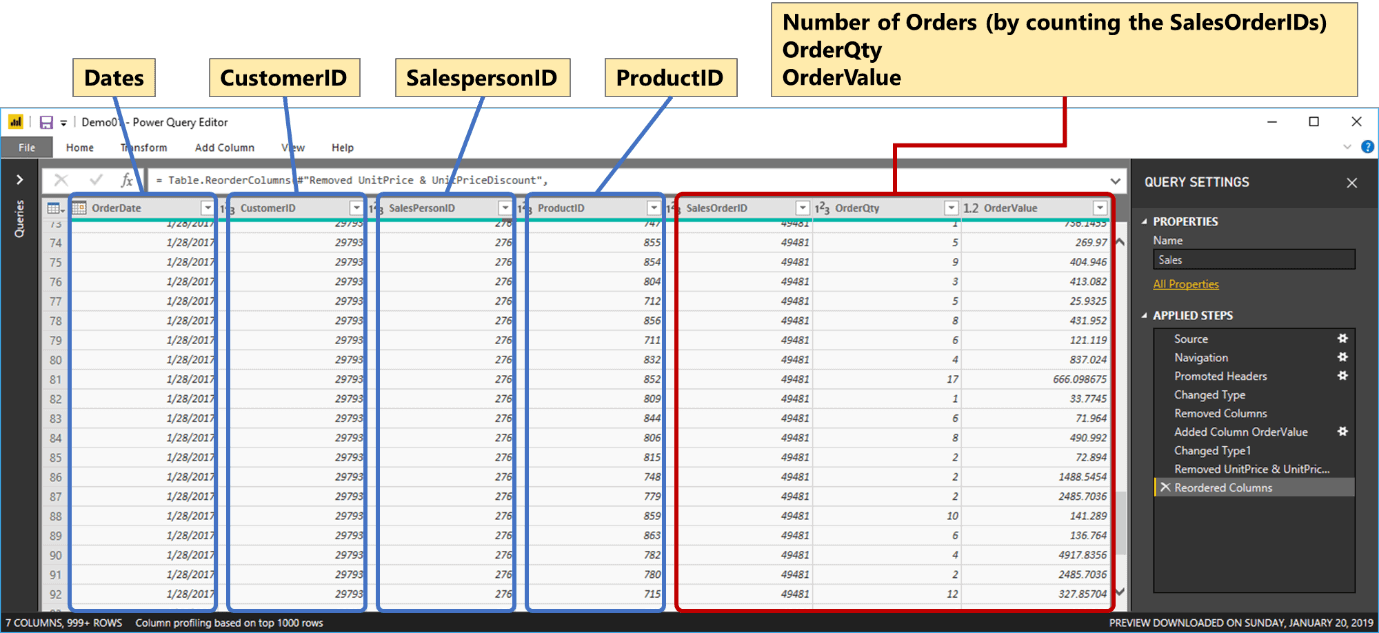
Figure 7: Sales table (stripped off dimension columns)
Each of the following columns, CustomerID, SalespersonID and Product ID should connect to their respective tables, Customer, Salesperson and Product (Figure 8, Figure 9 and Figure 10). He said that Ruthie should not worry about dates yet, and the OrderDate column can be used for dates, months and years because of the automatic hierarchy that Power BI generates for date columns.
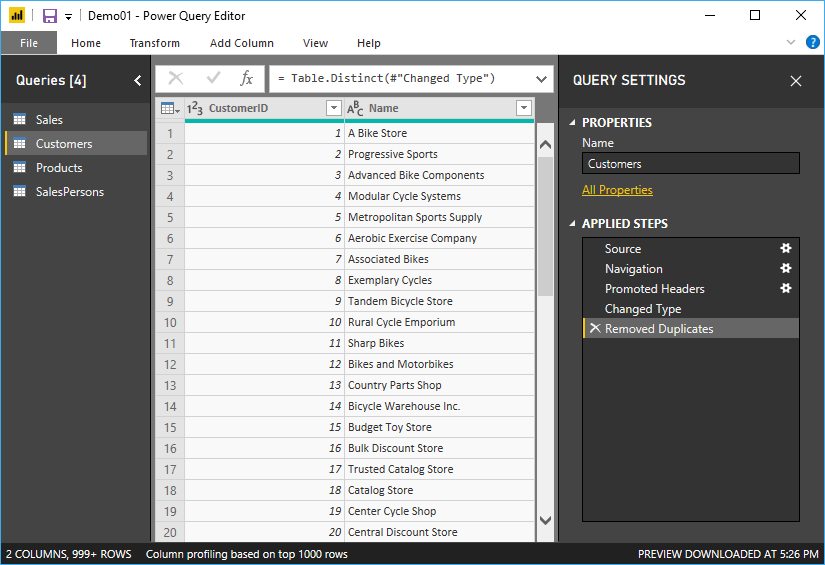
Figure 8: Customer dimension table
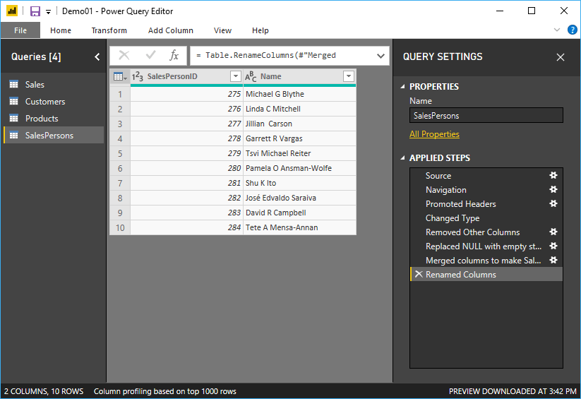
Figure 9: Salesperson dimension table
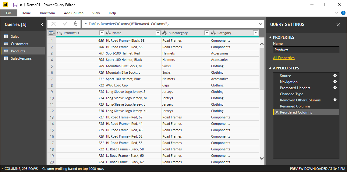
Figure 10: Product dimension table
George showed Ruthie the relationship tab and explained that product + customer + salesperson + date was the detailed level of data in the model. Moreover, for every combination of the grain that exists there should be one record, and that is why Power BI summarizes the rest of the columns. This structure, he said, was called a star schema due to its shape (Figure 11).
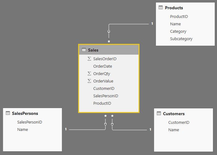 Figure 11: The sales dimensional model
Granularity
Then comes the issue of different granularity. The granularity of sales was product + customer + salesperson + date, while the targets’ granularity was product category + salesperson + month. Which means sales values and targets could be correlated at a higher level, but that would not be the case at a lower level. For example, you could get the total sales for 2018, and the total target values for 2018 and perform a comparison. Whereas, when you drill down to a lower level, for instance, to the product level, there won’t be any target values to show, because targets exist only up to the product subcategory level, which brings us to a dilemma.
Finally, Ruthie understood what all this fancy modeling meant. She reckoned that “being technical” was just a stigma that people put on others so that they didn’t have to do that job. However, all it takes was understanding the basics and the need to provide value to whomever you worked for, and you realize that most things are not that technical at all.
Ruthie was quickly able to create a dimensional model combining sales and targets: all it took was understanding the organization’s data and the basics of modelling.
She pulled in the Excel file for targets given to her by her boss Stephen.
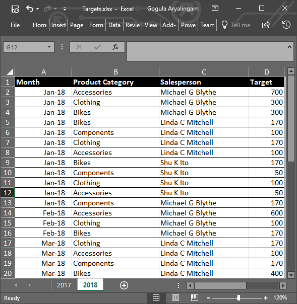
Figure 12: Targets spreadsheet
She then mashed it up with her existing data model, using the principles taught to her by George.
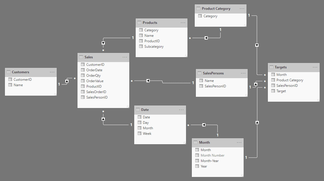
Figure 13: Dimensional model with Sales and Targets with different granularities
To compare the sales with its targets, but due to the difference in granularity, Ruthie split out the Products table by moving the category to its own table but keeping the link. So now, she can analyse the sales by products all the way to the category, and at the same time analyze targets alongside at the category level. She also created Date and Month tables and did the same.
This was what the sales portion looked like without targets:
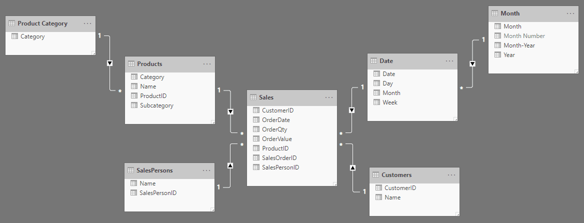
Figure 14: Sales star (snowflake) schema
Since the product category was pulled out of Products, and the Month table was separated out from Date, the star was now a snowflake.
This was what the targets portion looks like without sales:
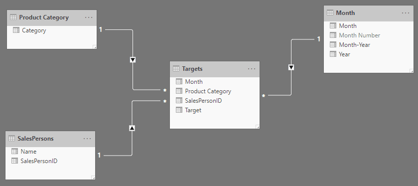
Figure 15: Targets star schema
Each of these star schemas, when put together make up the dimensional model in Figure 13.
Semantic Model (or Layer)
George told Ruthie that one of the most important things about modeling data for analysis was interfacing the data to the business user in the most business-centric way. To do this, one needs to apply a semantic layer on top of the dimensional model. This semantic layer can be almost the same as the dimensional model, or it can be much more sophisticated. The semantic layer (or semantic model) takes the dimensional model and applies business logic and business formatting on top of it. This is where measures and KPIs used by a business are created. For instance, business logic can be applied on top of the sales value fact by writing a calculation to generate the month-to-date cumulative sales value, or a calculation using both the sales value and the sales target to come up with the sales achievement ratio.
George showed how to create a simple measure on top of the data model. He said that before you create sophisticated measures, even the least sophisticated ones, you needed to first create the basic measures. These basic measures would be just the facts with an aggregation calculation wrapped around them. Then if dragged onto a visual on a report, the aggregated fact and a basic measure would work more or less the same.
He showed how to create a measure, and how it looked a lot like using Excel functions. Something that business users and analysts, those who swear by Excel, would love to see:
|
1 |
Revenue = SUM(Sales[OrderValue]) |
Figure 16 shows how the measure looks inside the model.
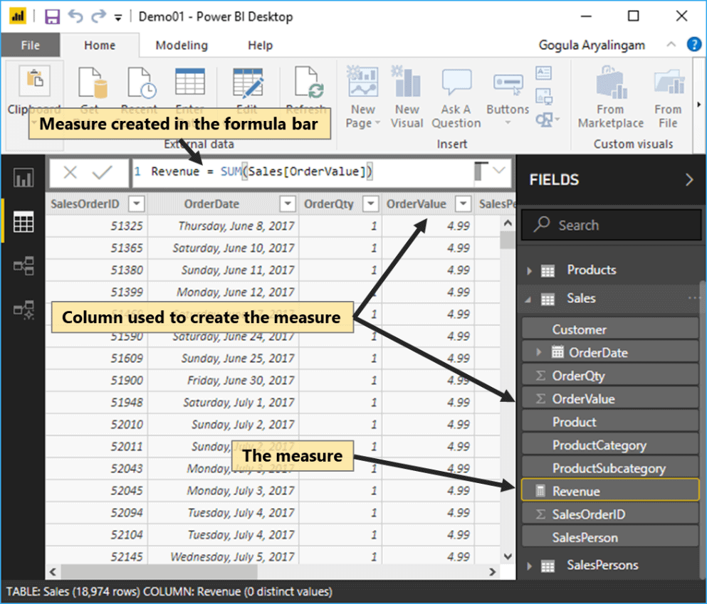
Figure 16: Creation of the Revenue measure
He explained that even if the measure appeared under the Sales table, it was because the Sales table had been selected when the measure was created, and that a measure can be placed in any table as long as it made sense.
He quickly demonstrated how the measure (Revenue) and the column that made it up (OrderValue) when placed on a visual behaved the same:
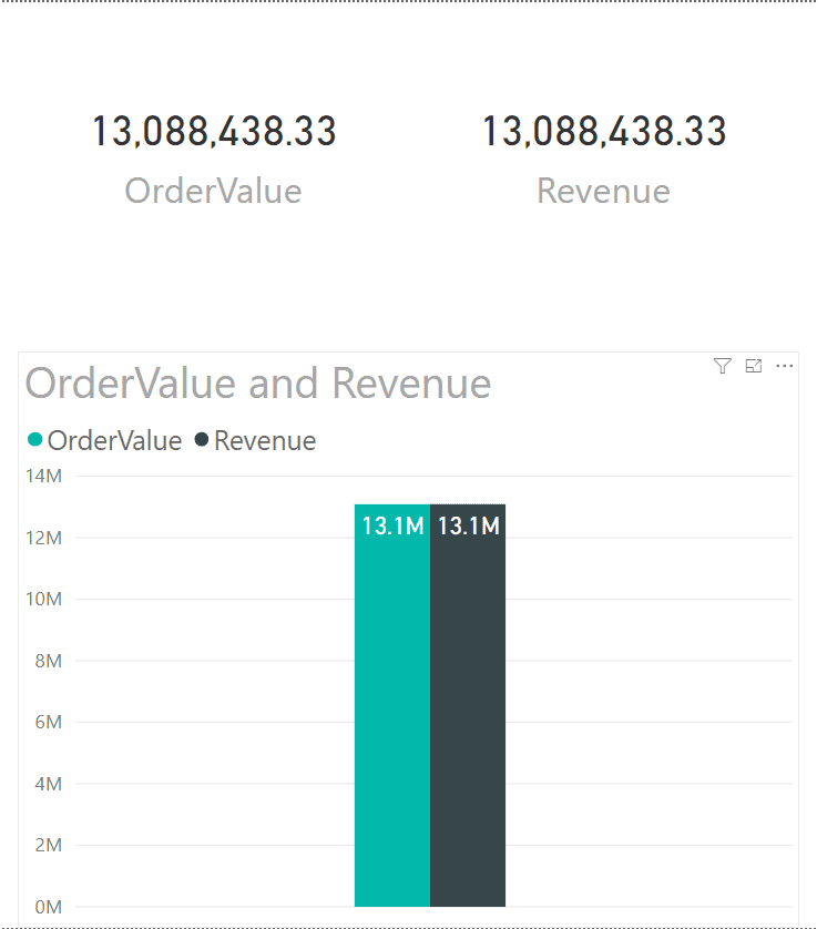
Figure 17: OrderValue (column) vs Revenue (measure)
“Then, why would you want to have measures?” was Ruthie’s obvious question. Well, that’s the first step before you create more complex measures on top of it, and what complex measures can do, in most cases cannot be done by mere columns, explained George.
He explained by taking an example: If you had the following data set how would you calculate the growth of sales?
|
Region |
Last Year |
This Year |
Growth |
|
A |
500 |
490 |
|
|
B |
550 |
720 |
|
|
470 |
710 |
|
|
|
D |
390 |
585 |
|
Figure 18: Sales example data set
The calculation you would use in the Growth column would be:
|
1 |
([This Year] – [Last Year])/[Last Year] |
The result:
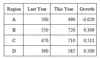
Figure 19: Sales example data set with growth calculation
Now, when you want the entire sales for last year, and the entire sales for this year, naturally it would be a sum of each column, where Last Year would yield 1910 and This Year would yield 2505. But when you need the growth for the entire year, summing up the Growth column and coming up with 1.3 (130%) is wrong. You would have to instead perform the same calculation on the totals of each column and come up with 0.312 (31.2%). This would hold true to at whatever level that you choose to perform an aggregation. You will have to perform the aggregations first and then do the calculation, instead of performing the calculation first and then performing the aggregations, and that’s just what a measure does.
Under George’s guidance, Ruthie created the following measures off sales and target facts:
|
1 2 |
Units = SUM(Sales[OrderQty]) Target Units = SUM(Targets[Target]) |
And then she created the following measure on top of these measures to analyze the target achievement ratio:
|
1 |
Achievement % = CALCULATE([Units]/[Target Units]) |
All in a Day’s Work
Ruthie felt a great deal of contentment after all the learning and the work that she had put in. She spent some time playing around with the model she had built. She put up different visuals, dragged in the measures she had created along with the other columns and tried out different analyses. The more she tried it out, the more ideas she got for additional types of analysis. She started thinking about bringing in more data points. For example, what if she could bring in website log files which had information on page hits? That way she could correlate page hits for the different product pages with that of sales and see if the AdventureWorks website actually played a part in boosting sales. The possibilities seemed endless, but first, she had to perfect the current model. There was so much that could be done with the current data set alone.
She stopped working for the day. Tomorrow she would perfect the model as best as she could, and then start applying the rest of the best practices and advice that George had suggested. She would also try to include Stephen’s suggestions as well.
As Ruthie found out with her session with George, all sorts of analysis can be performed on data, as long as the semantic model is built well. To have a well-built semantic model, the underlying data set should be modeled in the most flexible way possible; this is where dimensional modeling comes into play. With a little bit of technicality, business analysts can go a long way to provide value with data.

Load comments