
Windows Presentation Foundation (WPF) is simultaneously enticing and intimidating. It offers potential for amazing flexibility in UI design but there is a mountain of learning to climb. At the time of writing I am still very much in the foothills, gazing upward. This is my second article on WPF wherein I attempt to give both you and me a “leg up” on the WPF climb from a unique perspective. In this article I present a collection of little known but useful utility applications that can assist you as you learn and develop WPF code.
Notice: This article is heavily dependent on a collection of links to external sites. They were all accurate at press time but by the time you read this one or more could easily have changed or evaporated. That is just the nature of the beast…
SDK XAML Browser
The SDK XAML Browser from Microsoft lets you select a layout container or control in the navigation panel, then shows you the XAML and a rendering of the control in isolation in the main panel.
|
Available from: |
Microsoft |
|
Web Page: |
|
|
Installation: |
Download Visual Studio source tree. Compile the solution to create the application in the standard bin/Debug directory in the tree. |
|
Version: |
0.0.0.0 |
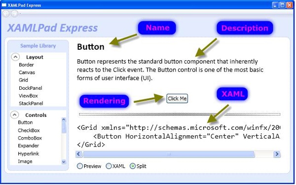
Figure 1 XAMLPad Express aka SDK XAML Browser
Once you have installed it and have generated an executable, run that executable and you should see the SDK XAML Browser shown in Figure 1 (the XAMLPad Express name on the title bar notwithstanding!).By default the SDK XAML Browser examines the Button control, showing a description of the control, a rendering of it, and the XAML that produces it. I have labeled these parts of the display. Select any other element from the Layout or Controls menus in the Sample Library panel at the left to explore it similarly. The browser provides the common XAML-designer choices of displaying both the rendering and the XAML together (the Split choice shown), or viewing them separately (the Preview and XAML radio buttons).
Note that neither the Layout choices nor the Controls choices contain all the elements available in Visual Studio 2008, let alone VS 2010. After reviewing the source for the application, I’d say that it looks like you need only add additional elements to the samples.xml library file to have them render in the browser.
Type Explorer
XamlT-short for XAML Type Explorer-provides a unique interface to examining class diagrams specifically for WPF classes.
|
Available from: |
Rob Relyea (Microsoft WPF Team) |
|
Web Page: |
|
|
Installation: |
ClickOnce installer |
|
Version: |
unspecified |
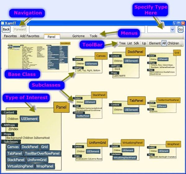
Figure 2 XAML Type Explorer aka XamlT
Select a type of interest in the upper right combo box, for example, “Panel” (Specify Type Here points to this in the figure) and click Go. The Type of Interest displays in the lower left, enumerating the content of the element; the properties, both normal (Props) and attachable (AttProps); and the defined Subclasses. Just above the Type of Interest is the Base Class (in this case a FrameworkElement). The right side of the window displays all the Subclasses of the target type; the figure shows 9 subclasses for Panel.
The toolbar provides a few other useful features. The first group of 3 buttons (Tree, List, and SDK) switches between the default graphical rendering and two alternate displays. The List mode displays a simple XML output of all defined WPF elements with their properties, highlighting the current element. The SDK mode switches to the MSDN web page containing the API for the class. The Up button moves from the class to its base class (the same as clicking on the base class in the window). In this example, that would change the target from Panel to FrameworkElement. The final group of 3 buttons (Element, All, and Children) change the display for the target class. First, note that the Children button should actually be labeled Subclasses. Selecting Element isolates and enlarges just the target class (the lower left in the figure). The Children (subclasses) button similarly isolates and enlarges just the subclasses.
Finally, the menus provide a few other convenience features, primarily letting you collect your favorite classes and have quick access to them. The Go Home button returns to the opening screen where you select a library or XAML file. The Tools menu gives you a couple handy features in case you are writing an article :-). You can enable Draw Mode whereby you can draw with your mouse on the image and you can save a snapshot of the window.
So how is this utility useful? Maybe you’ve found some sample code, or you are writing your own, where you have some UI element like a StackPanel. A common question is this: what other elements could be used in place of a StackPanel? Go to XamlT and specify StackPanel. Recall that the base class will display in the upper left. In this example, you would find that Panel is the parent to StackPanel. Click on the base class (or type in Panel in the upper right box) to switch from StackPanel to Panel-you would then see the display in the figure. At a glance you now have all of StackPanel’s siblings on the right side of the window. So anywhere you could use a StackPanel you could instead use a DockPanel or a Grid.
Rob Relyea introduced his TypeExplorer for WPF at the Mix07 conference. You can watch his presentation on WPF Fundamentals, including demonstration of the TypeExplorer here (http://robrelyea.com/events/mix07). By the time he released the utility, however, the name became XamlT, which made it a little bit tricky to find!
Gradient Editor
This Gradient Editor lets you define a color gradient graphically with an arbitrary number of bands and returns a XAML code fragment for you to paste into your application.
|
Available from: |
Layne Thomas |
|
Web Page: |
|
|
Installation: |
Download Visual Studio source tree. Compile the solution to create the application in the standard bin/Debug directory in the tree. |
|
Version: |
unspecified |
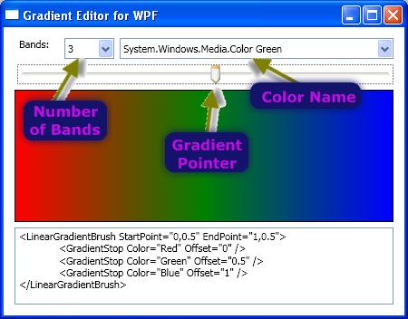
Figure 3 XAML Gradient Editor
Specify the Number of Bands in the combo box to define how many transitions you desire. The editor defaults to three, as shown in the figure, so you see three GradientStop elements in the generated XAML code. Move the Gradient Pointer along its track and the Color Name just above changes to indicate the color in that portion of the gradient. You can change the color for that portion of the gradient by opening the drop down of the Color Name box and just picking a different color. Your choice will immediately reflect in the rendered gradient and the XAML code. Experiment by changing the number of bands and you will see that the offset values for each GradientStop automatically recalculate, saving you a lot of tedious handwork.
Snoop Visual WPF Debugger
Snoop is a standalone WPF inspector that can attach to the WPF application of your choice and let you explore its visual content.
|
Available from: |
Cplotts |
|
Web Page: |
|
|
Installation: |
Download source or installer. |
|
Version: |
unspecified |
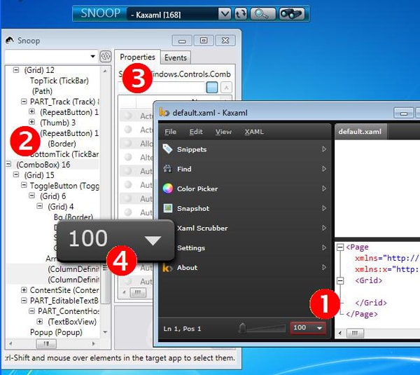
Figure 4 Snoop XAML Debugger/Inspector
When you start Snoop, all you will see is the toolbar at the very top of the figure. Open the drop-down selector and you will see all your currently active WPF processes. If you have not yet started your app, do so; then click the refresh button next to the dropdown so as to make it appear in the list. In this example I was running the Kaxaml editor (right, front window in the figure). Once you pick the application of interest, click the examine button (the binoculars) to open the inspector panel (left, rear window in the figure). The Snoop inspector panel provides the visual tree on its left side and the currently selected item’s properties and events on the right.
Snoop provides a couple of very handy features for identifying elements in your application. Say, for example, you want to examine the drop down zoom button (point (1) in the figure). Hold down Control and Shift and hover your mouse over the button. That element will immediately be selected in the Snoop tree (point 2 in the figure) with its properties displayed (point 3 in the figure). Alternately, you can click on the element in the Snoop window (point (2) again) and Snoop will render an enlarged, free-floating copy of that element (point 4). At the same time, the actual element in your application will be highlighted with a red border (refer back to point 1 in the figure) so you can be very sure of what you have selected.
Snoop lets you do quite a bit more, including:
- Identifying recently changed properties.
- Edit writable properties.
- Identify unset properties.
- Delve into property bindings.
- Preview and zoom a specific element.
- 3D zoom to show the visual composition of an element.
See the Snoop web page for more details.
DumpControlTemplate
DumpControlTemplate displays the default ControlTemplate for any WPF control.
|
Available from: |
Charles Petzold |
|
Web Page: |
|
|
Installation: |
Download zip file containing all code samples from his book. Go to Chapter 25 to find the DumpControlTemplate.sln and build that. |
|
Version: |
unspecified |
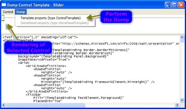
Figure 5 DumpControlTemplate
To appreciate a ControlTemplate dumping utility, it helps to know what a ControlTemplate is. And since I am aiming for a novice audience, here it is: Principally there are ControlTemplates and DataTemplates. A ControlTemplate lets you specify the appearance of a control itself, while a DataTemplate lets you specify the appearance of the content on a control. This post on StackOverflow (http://stackoverflow.com/questions/1340108/differnce-between-control-template-and-datatemplate-in-wpf) provides a bit more detail between the two. Sahil Malik’s blog (http://blah.winsmarts.com/2007-2-WPF__ControlTemplate_-_Completely_Swapping_the_UI_of_an_Element.aspx) provides even more in-depth details with code examples.
The Dump Control Template utility comes from the prolific toolbox of Charles Petzold. It is available in the code download that accompanies his book Applications = Code + Markup: A Guide to the Microsoft® Windows® Presentation Foundation at the web address at the top of this section. Even if you do not own the book, anyone may freely download the code archive at the web address above. The utility is trivially simple to use. Select a control from the Control menu. This renders the control immediately below the menu bar; you can see the slider control indicated in the illustration. (Unfortunately many controls render as an empty box so you will typically not see very much in the rendering; I picked a slider because at least you see something!) After selecting the control, choose the appropriate dump command from the Dump menu to perform the dump. This gives you access to the templates from all the standard controls, which you can use to both learn from and to leverage in designing your own. For further reading, see Petzold’s article Using Templates to Customize WPF Controls (http://msdn.microsoft.com/en-us/magazine/cc163497.aspx) where he discusses this utility.
SDK + Sample Viewer
SDK Viewer provides all the SDK documentation for WPF in a rich client application, and provides a large cache of samples within an integrated viewer.
|
Available from: |
Microsoft |
|
Web Page: |
|
|
Installation: |
Download Visual Studio source tree. Compile the solution to create the application in the standard bin/Debug directory in the tree. |
|
Version: |
unspecified |
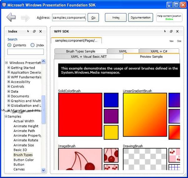
Figure 6 SDK Viewer
The SDK Viewer provides a streamlined interface to all the WPF documentation, from Getting Started on down-see the top portion of the index on the left. The SDK documentation viewer lets you view online or offline documentation as well as allowing you to annotate it with your own notes. The sample viewer (illustrated) provides a large cache of WPF samples with an integrated viewer. The figure shows Brush Types selected from the index on the left. That displays the five tabs on the right, showing pure XAML, or XAML mixed with C# or Visual Basic, and finally a rendering of the sample.
XamlPad and its Successors
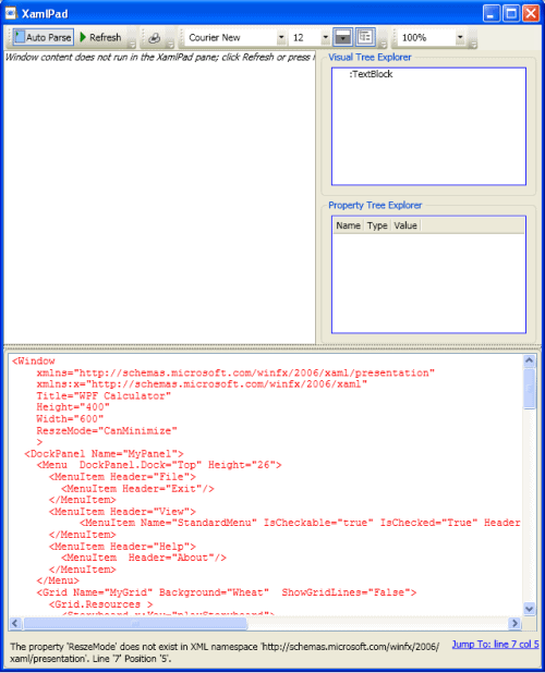
NotePad was one of the earliest applications that was a lightweight version of a more powerful program; designed to launch faster and provide a subset of the functionality of a large, rich application. LINQPad is a much more recent and notable addition to this cadre of applications, providing a great scratchpad for LINQ and C# code exploration. XamlPad follows in that tradition, providing a sandbox for experimenting with XAML code. Just as NotePad does not provide the richness of Microsoft Word, XamlPad (and its kin) provided trimmed-down capabilities compared to what you can do in Visual Studio.
XamlPad is installed automatically when you install Visual Studio 2005 or 2008. Contrary to the MSDN documentation page, however, the SDK installed by Visual Studio does not create an entry in the start menu for XamlPad so you must create your own start menu shortcut manually. (The executable is located at \Program Files\Microsoft SDKs\Windows\v6.0A\bin.) Curiously, in VS2010 (using SDK version 7.x), the XamlPad application is missing!
XamlPad is great for exploration and for trying out quick ideas with XAML. So much so, in fact, that it inspired a number of talented individuals to come up with enhanced versions. Table 1 compares the original XamlPad with popular contenders. Green shading in the table indicates a strong advantage, while lavender shading indicates a weaker advantage, as compared to unshaded cells. These determinations are generally unbiased; by that I mean that my personal design style does not affect the choice. For example, line 17 indicates that three of the six have a visual tree browser; everyone would agree (I think!) that having one is better than not having one. (Compare that to talking about indentation style, for example, something that many are very passionate and particular about.) My one exception is line 28. Some of the apps are stable products, providing only executables to do the job. Others are more experimental or sandbox adventures, providing the source code, and giving you a great learning opportunity. I mark both of these as strengths because reasonable people could easily argue that either one is “better” than the other.
|
|
XamlPad |
XamlPadX |
XAML Cruncher |
Kaxaml |
XamlPad Sample |
XamlHack |
|
|
|
Visual Features |
||||||
|
1 |
Syntax highlighting |
Yes |
Yes |
Yes |
|||
|
2 |
Search and replace |
Yes |
Yes |
Yes |
Yes |
||
|
3 |
Show grid |
Yes |
|||||
|
4 |
Zoom |
Yes |
Yes |
Yes |
|||
|
5 |
Line numbers |
Yes |
Yes |
Yes |
|||
|
6 |
Error indicator |
Yes |
Yes |
Yes |
Yes |
Yes |
|
|
7 |
XAML/Output positions adjustable |
Adjustable splitter |
Adjustable splitter |
Yes |
Adjustable splitter |
Adjustable splitter |
Separate tabs |
|
8 |
Render <Window> |
Popup |
Popup |
Popup |
Popup |
In editor |
Popup |
|
|
Productivity Aids |
||||||
|
9 |
Intellisense |
Yes |
|||||
|
10 |
XAML reformatting |
Yes |
Yes |
Yes |
Yes |
||
|
11 |
XAML cleaner |
Yes |
|||||
|
12 |
Samples |
Few |
Yes |
Yes |
|||
|
13 |
Gradients |
Yes |
Yes |
||||
|
14 |
Styles |
Yes |
Yes |
||||
|
15 |
Color picker |
Yes |
Yes |
||||
|
16 |
Load assemblies |
Yes |
Yes |
||||
|
|
Tools |
||||||
|
17 |
WPF Tree explorer |
Visual |
Visual |
Visual and Logical |
|||
|
18 |
Command interpreter |
Yes |
|||||
|
19 |
Control styles explorer |
Yes |
|||||
|
20 |
Property explorer |
Yes |
|||||
|
21 |
Resource explorer |
Yes |
|||||
|
|
Output |
||||||
|
22 |
Snapshot |
Yes |
Yes |
||||
|
23 |
|
Yes |
Yes |
Yes |
|||
|
|
Support and Development |
||||||
|
24 |
Documentation |
Little bit |
Little bit only for command interpreter |
Little bit |
Tooltips |
Blog entries |
Little bit |
|
25 |
Support |
Comment on blog |
Email address on web site |
Email address |
Comment on blog or email |
Comment on blog or email |
|
|
26 |
Last release |
2006 |
2008 |
2007 |
2007 |
2010 |
2007 |
|
27 |
Actively being developed |
unknown |
unknown |
Yes according to 2010 blog entries |
Yes |
unknown |
|
|
28 |
Product State |
Stable product |
Stable product |
Source code available; learn from it! |
Stable product |
Source code available; learn from it! |
Stable product |
Table 1 Comparison of Lightweight XAML Authoring Tools
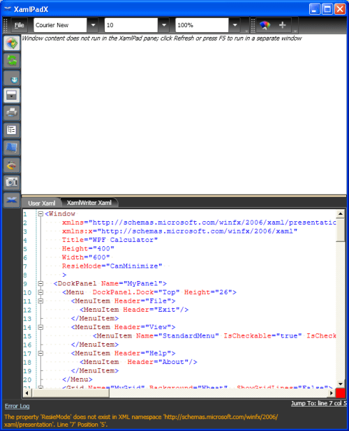
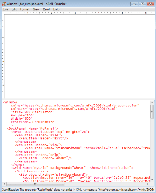
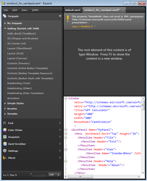
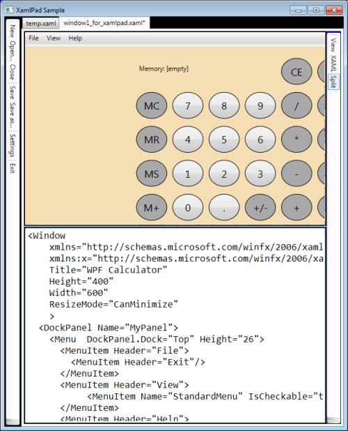
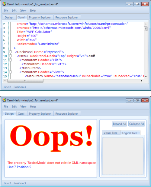
Tabular comparisons are nice, but to give you a real sense of their look and feel and how they compare to each other I came up with the tabbed display shown next. Just click on a tab to see that application with the same bit of XAML code. I deliberately introduced a validation error into the XAML so you would see how it displays the error. XamlHack has a novel-if not terribly useful-way: a giant “Oops!” (though it also lets you click on the line indicator to take you right to the error). Note that, with the exception of XamlPadSample, none of the screen shots show the rendered XAML (even discounting my deliberately injected error). That is because the top-level XAML container is <Window>. Line 8 in the table reveals that five of the 6 apps render <Window> in a separate pop-up, hence the rendering is not shown in the main windows illustrated here.
One other unusual item is the placement of the XAML and the preview rendering. As line 7 details, most of the apps simply have an adjustable splitter to increase the height of one and decrease the other simultaneously. XamlCruncher is a bit better, by giving you more flexible placement control of the two panels, while XamlHack is a bit less convenient: the two panels are on separate tabs and cannot be viewed together (I have manually pasted them together in the composite screen shot.)
You can likely infer what most of the items in Table 1 mean except perhaps for the Tools section:
- A tree explorer lets you examine-bear with me here-a WPF tree. There are two types: the visual tree and the logical tree. These both provide information on the structure of your XAML composition-see Trees in WPF (http://msdn.microsoft.com/en-us/library/ms753391.aspx) for details and distinctions between the two.
- The command interpreter from XamlPadX lets you manipulate and inspect objects in a similar way to the Visual Studio debugger. Upon opening the command interpreter in XamlPadX, click the help icon at the lower right to get some hints on what to do. It explains things like how to inspect anonymous objects (those that you have not named) by right-clicking the object in the visual tree explorer, and how to invoke its version of Intellisense with the left Control key. XamlPadX’s command interpreter is a superset of XamlHack’s property explorer, which lets you examine properties of a given control.
- The control styles explorer lets you view the WPF styles for any control by selecting it from a dropdown list.
- XamlHack’s resource explorer purports to let you convert BAML to XAML according to the website, but I am not familiar enough with this notion to comment on it.
Here are details of the XamlPad alternatives from Table 1.
|
XamlPad |
From: |
Microsoft |
|
Web Page: |
||
|
Installation: |
Pre-installed with VS2005 and VS2008; not present in VS2010 |
|
|
Version: |
unspecified |
|
|
XamlPadX |
From: |
Lester Lobo (Microsoft) |
|
Web Page: |
http://blogs.msdn.com/llobo/archive/2008/08/25/xamlpadx-4-0.aspx |
|
|
Installation: |
Standard Windows installer |
|
|
Version: |
4.0 |
|
|
XAML Cruncher |
From: |
Charles Petzold (prolific author, columnist, and MVP) |
|
Web Page: |
||
|
Installation: |
ClickOnce installer available from the above web page -OR- Get the source tree and build it yourself (AppsCodeMarkup, chapter 20). |
|
|
Version: |
2.0 |
|
|
Kaxaml |
From: |
Robby Ingerbretsen (user experience designer, formerly with Microsoft) |
|
Web Page: |
||
|
Installation: |
Standard Windows installer; provides context menu integration |
|
|
Version: |
1.0 |
|
|
XamlPad Sample |
From: |
Rob Relyea (Microsoft) |
|
Web Page: |
||
|
Installation: |
Download a zip file with the source tree, including executable |
|
|
Version: |
1f |
|
|
XamlHack |
From: |
Zhou Yong |
|
Web Page: |
http://shevaspace.spaces.live.com/blog/cns!FD9A0F1F8DD06954!505.entry (link deprecated) |
|
|
Installation: |
Download a zip file with the executable |
|
|
Version: |
1.0 |
Table 2 Installation Details for Lightweight XAML Authoring Tools
Seemingly Limitless Avenues Yet to Explore…
I have barely scratched the surface of WPF utilities, samples, and demos. I have discussed two selected utilities (DumpControlTemplate and XamlCruncher) from the code library accompanying Petzold’s book, but he has many, many more! Similarly, I showed the many samples available inside the SDK Viewer provided by Microsoft. The SDK Viewer itself, though, is just one of a couple dozen sample applications available on the same web page. And Microsoft provides yet another great source for samples at the WPF Documentation Samples page (https://msdn.microsoft.com/en-us/library/ms771633).
Finally, here are starting points for a few other XAML/WPF aspects to consider:
The WPF Performance Suite (http://msdn.microsoft.com/en-us/library/aa969767.aspx) “…enables you to analyze the run-time behavior of your WPF applications and determine performance optimizations that you can apply. The WPF Performance Suite includes performance profiling tools called Perforator and Visual Profiler.”
Microsoft’s XAML Toolkit (https://github.com/xyzzer/WinRTXamlToolkit) “…is a set of libraries enabling FxCop for XAML (Silverlight)/BAML (WPF), a XamlDom for XAML tools and utilities and add-on for System.Xaml.dll (.NET 4) to enable it to understand Silverlight XAML.” (I do not yet have an appreciation for what this means, but it certainly sounds impressive.
There are a slew of XAML converters available so you can take advantage of designs from many other applications, including Photoshop, Visio, Flash, SVG, WMF, and more. Christian Moser has perhaps the most concise and complete list I have seen for these, available here (http://www.wpftutorial.net/XAMLConverters.html).
Load comments